ICO?
New logo discussion?
kakubei
#97
Based on a logo I saw here, I quickly sketched this one out. I think the Sublime Text logo should be sublime, simple, and peaceful. What do you think, does anyone like it?


0 Likes
tychonaut
#98
Hey Guys!
I am new convert to Sublime Text… but I’m lovin’ it and will definitely be spreading the word!
However, upon first launching the app, I honestly thought the present logo was actually some strange graphic glitch or failure with the icon file somehow. It looks like some kind of tiny .gif which has been maginified to undignified proportions. It is almost “anti-logo”. Has now beaten the “Terminal” icon for the title of “Worst Icon on Kris’ Dock” (not affiliated in any way with the restaurant chain of the same name).
So I have decided it is my duty to try my hand on this. For the past 10 minutes I have focused copious amounts of my brainpower to problem of your graphical representation. And this is the result. I hope it gives you an erection, as it did me. And I don’t mean that in a weird way.
Basically… I just tried to think of what people associate the word “sublime” with. Other than a big letter “s”, of course. I could only think of one thing.

0 Likes
kakubei
#99
The problem is that logo reminds me os Adobe Illustrator (way back when) which was something very similar but Boticelli’s Venus instead of Da Vinci’s Gioconda.
0 Likes
natebeaty
#100
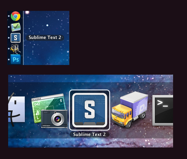
I updated my icon to be a little cleaner, a bit fatter of a border, and use a more updated version of a code sample:

Still a little rough as I don’t have too much time to fuss with it, just a little distraction from coding. OS X .icns file if anyone wants the updated version:
Sublime Text 2.zip (230 KB)
Here’s some shots of it in context, to see how it stands out in the dock when smaller, and among other apps when task-switching:
0 Likes
tychonaut
#101
Harumph.
One could argue that there is more difference between Boticelli’s venus and a DaVinci’s Mona Lisa… than between one variety of “s inside a thing” than anther variety of “s inside a thing”. (it looks like Skype… It looks like Superman… It looks like a stop sign… It looks like… )
But you dont like it, so that’s cool. No. Really… it’s ok.
sniffle
0 Likes
nobleach
#102
[quote=“Squiggle”]Taking some inspiration from a variety of the icons already posted, here is a first attempt at another variation (although I’m no icon maker, so I don’t know what I’m doing). Please feel free to run with it.
Text in the background is part the svg file itself and sublime_plugin.py for the right hand side, using solarized dark theme.
All done with Inkscape.
[attachment=1]sublime-text-2-icon.png[/attachment][/quote]
This is the one that I use. I freakin LOVE it.
0 Likes
dmatarazzo
#103
Just thought I’d throw another icon into the mix… I tried to keep some spirit of the while representing the theme I use (Tomorrow Night 80s, https://github.com/ChrisKempson/Tomorrow-Theme). It could certainly use some more refinement.

Sublime Text 2.icns.zip (228 KB)
0 Likes
andyjeffries
#104
I love @natebeaty’s icon (and am using it now), but I have to be honest - pretty much any of the icons posted so far would be better than the default one. For such a superb piece of software, the icon really does look awful (and doesn’t give me quick visual distinction between that and a terminal when I have a lot of apps open).
0 Likes

natebeaty
#106
My latest tacky offering, this one more in the gray palette of the original icon:

OS X icns file:
Sublime Text 2.zip (194 KB)
0 Likes
msthmnd
#107
you’re actually contradicting yourself, tacky is another way of saying its cheap looking or poor quality,
Now if you say it to someone worked on these logo that they’re designs are tacky, how could anyoune be offended by that? 
@ natebeaty
loving your new icon, I think the way you’re using grey palette is more loyal to the original icon  . I like this better than the blue one, well done
0 Likes
DrDran
#108
[quote=“natebeaty”]I can’t stop fussing with this thing. Here’s another pass, this time larger:

…odd having to pick the code to show in the icon. I’m assuming CSS isn’t the most common use of ST2, and there could probably be a more elegant snippet of something on there. But you get the idea.[/quote]
I love that Icon, i’m using it on my Linux and Windows desktop.
So I think that will be more cool make some extension specific icon , like package extension etc. etc.
My 2 cents
Franco
0 Likes
natebeaty
#109
I don’t take offense as I agree for the most part. But seeing these icons so large is deceiving. Once they’re in use on the dock or task switcher, they’ve been reduced to a (hopefully) easily identifiable, abstract shape. All the silly details, the gloss, shadows, code sample, etc, are extremely minimal at the size of use.
I like the simplicity of the original icon, and I like some of the more direct plays off of that, but most of them have the same problem as the original: they’re really hard to identify at a glance in context. (Often being confused with the Terminal.)
As far as I’m concerned, these are all just playful tributes to an editor we’re all really enjoying using. Someone will come along (or perhaps Jon will hire an icon designer at some point) with a genius idea that matches the feel & aesthetic of ST2. The same thing happened with TextMate ages ago – there was a rapid development and engaging dialog with the developer, many icons were proposed, many of them just as tacky as what we’ve all been offering up, and eventually an entry jumped out as The One. At least to Allan.
Also, dude, lay off the adverbs! Haha.
0 Likes
Nevir
#110
Here’s a variant following the Flurry icon style. Still needs tweaks; curious if you guys have any ideas. It also is not hinted, so viewing it below 128px gets muddy and loses contrast between the borders:
http://nevir.net/design/Sublime%20Text%202%20-%20512.png
Staying with the dark feel of the existing icon. Perhaps it’s a bit too dark.
0 Likes
daylerees
#111
Not a logo, but an angle for logo discussions :
http://cdn.lts.cr/files/ab0e9527d05506f43e6d/st2.png
Font is : Akashi
0 Likes
daylerees
#112
or
http://cdn.lts.cr/files/ab0e9527d05506f43e6d/s2.png
I guess the T is in the negative space.
edit : this would work better with a non rounded font obviously.
With the right font I would recommend, making it a bit tighter, so the overall shape is square, lots better for logos.
0 Likes
alexlittlejohn
#114
I created one for myself based on another one I saw.
alexlittlejohn.deviantart.com/#/d4dauy6

0 Likes