How about something like this?
https://img.skitch.com/20110210-bypcpe943t77beh9nemj9j5dfj.jpg
A pretty rough sketch but you get the idea.
How about something like this?
https://img.skitch.com/20110210-bypcpe943t77beh9nemj9j5dfj.jpg
A pretty rough sketch but you get the idea.
It was an exaggeration to make a point.
I never stated that you in fact said those sentences. I stated that what you said was equatable to those sentences and was what they were implying. The majority of my previous post actually had nothing to do with your previous correction. It would seem you are ignoring what I am saying? Or perhaps responding to it in part and not as a whole? You clearly read my entire post so I don’t see why you would state that I am only attacking you on that one point when as I said the majority of my previous post had nothing to do with it.
[quote=“charlesroper”]Let me break down what I am saying so that there can be no misunderstanding:
My assertion: Icons should not necessarily be literal
My evidence: Most successful icons are not literal
My conclusion: Therefore the Sublime icon does not need to be literal in order to be successful
Clear?[/quote]
Perhaps the rift between our stances is due to your conclusion? I see no point in doing anything in this world unless your goal is to make it the best. Obviously this isn’t always a realistic or attainable goal but it should always be THE goal, in my opinion. Making an icon that’s just successful really doesn’t register with me. That’s like making something and saying: Oh hey, it works, good enough! For me it should always be: Oh hey, it works! Now how to make it better?
It really isn’t to me based on what I consider literal. I’d consider most of the icons in my bookmark toolbar to be literal.
To further clarify I said Sublime’s icon needs to be more distinct and I’d prefer this being accomplished by making it more literal. The main point being that the icon needs to be more distinct whether it’s in a way that is preferable to me or not.
Your first statement hinges very heavily on what you’d consider to be literal. Sure abstract may be more flexible, but having a completely abstract icon can really backfire when no one can place what that icon or logo belongs too. I’d argue an abstract icon would only be possible if you have the means and audience to push that icon being yours. Or if simply it being recognizable is of no importance to you.
Again, I stated this above, in my last post, and I believe in the one before that. I said I only preferred that it becomes more distinct by way of becoming more literal. The main point was that it needs to be more distinct and I supplied the way I would prefer this being accomplished.
[quote=“charlesroper”]You are stating your personal opinion too, that the Sublime icon should be made more distinct by making it more literal - you’re saying we should be able to “tell Sublime’s purpose from it’s icon.” If you knock out “purpose” from that sentence, we’d be in agreement.
The criterion I have for judging an icon to be successful is the body of icons and logos and brands I see around me and making a judgement call on which are successful based on whether the company or product is successful. Is that not reasonable?[/quote]
I never stated my argument was fact. The above was merely in response to your claim “I’m not making this stuff up” and attempts of passing off everything you were stating as fact. I’m saying: "You should be able to tell Sublime’s icon is Sublime’s icon and it should never be possible in any situation to be confused for another apps icon."
I suppose your criterion is passable although it gets very fuzzy based on what sense you’re considering something to be successful. You may consider Sublime to be successful but in the scheme of things it really isn’t. I believe it has the capability to be, but there is nearly 0 word-of-mouth and absolutely no marketing behind it. You ask 10 people what their text editor of choice is likely 0 will name Sublime. Out of 100, maybe 5? And that’s probably being generous. Sure 5 might be better than a lot of other editors, but editors are a dime a dozen and while it might be more successful than those that doesn’t make it successful in the scheme of things.
Again, this is all down to our interpretations of literal and abstract when it comes to icons and logos.
Literal in the sense of pertaining to it’s use or name. The NFL logo is literal, it is made up of the letters “N”, “F”, and “L”. CloudApp’s icon is literal. It’s icon is a cloud. GiantBomb’s icon is literal. It’s a giant bomb. GMail’s icon is literal. It’s icon is an envelope. YouTube’s icon is literal. It’s icon is made up of the words “You” and “Tube”.
An abstract icon is one that is in no way associative in any form to what it belongs to. Chase Bank’s logo to me is the perfect example of abstract.
I know it’s not a bottle. I even state later on that it’s a good example of an abstract logo -_- My point was if you wanted to create a literal Pepsi logo, a bottle is not the only way to accomplish this. A logo containing simply the word “Pepsi” would be a literal logo.
Have you ever tried searching for “metaphorical icons”. If you asked someone if YouTube’s icon was literal or not, what do you think their response would be?
YouTube is quite literal. It consists of the words “You” and “Tube”. It’s just literal to it’s name and not to it’s use. Twitter is literal to it’s use, arguably, which is why I stated it being a stretch. I was more arguing that Twitter’s icon was more literal than it was abstract.
Nearly every logo on that page you linked is literal to the name of whatever is in question. Tampa Bay Lightning’s logo consisting of the words “Tampa”, and “Bay” along with a lightning bolt… come on! The only abstract icon on see on that entire page is Viva. NBC Universal’s logo is the words “NBC Universal”.
[quote]literal:
1. in accordance with, involving, or being the primary or strict meaning of the word or words; not figurative or metaphorical: the literal meaning of a word.
2. following the words of the original very closely and exactly: a literal translation of Goethe.
3. true to fact; not exaggerated; actual or factual: a literal description of conditions.[/quote]
4. being actually such, without exaggeration or inaccuracy: the literal extermination of a city.
5. (of persons) tending to construe words in the strict sense or in an unimaginative way; matter-of-fact; prosaic.
6. of or pertaining to the letters of the alphabet.
7. of the nature of letters.
8. expressed by letters.
9. *affecting a letter or letters: a literal error. *
That is not what I’m saying. Also, again, I never stated Sublime’s icon HAD to be literal, I said I preferred it. What I said it had to be was more distinct.
I have stated this like 5 times now : I never said literal icons are better, I said I preferred them. I did however state distinct icons are better than generalized and generic ones. I stated Sublime’s icon is a bad one because it’s generic and it would be improved by making it more distinct and that I’d prefer it accomplish this by making it more literal, but the main point being it needs to be more distinct regardless if it accomplishes this in a way I prefer or not.
I also stated, I think 2 posts ago now, that Sublime’s icon isn’t that bad and that a strong feature set speaks louder than an amazing icon. (I think I bolded it then as well D:)
Perhaps we should move on but I always enjoy a good debate, even if it’s over something as silly as an icon :s
Sublimetext’s logo was made by Kazimir Malevich
en.wikipedia.org/wiki/Kazimir_Malevich
Icons? Silly? How dare you. 
It looks like our debate was really over the word literal and what we meant by it. I don’t categorise logotype to be a literal rendering of a logo because letters are an abstract form in themselves. The word ‘hammer’ does not look anything like a hammer or in any way hint at the action a hammer performs. I suppose onomatopoeia is getting close. But, actually, literal is literally expressing something in words (one of the definitions anyway), so I see where you’re coming from. I was thinking in terms of literal being an accurate, literal rendering of what the app does as with iCal’s icon: it’s a picture of a calendar. By my definition, for it to be literal, the NFL logo would need to be a picture of a football field with players on it and goals and the like.
But anyway, good debate. Did we get anywhere? Probably not, but we bored the socks off everyone here I think. Deepest respect to you for not turning it into flame war - it’s good to know the net has decent people inhabiting it still.
Aye, the feeling is mutual. A good debate is always a good device to get the brain churning. It always amuses me when people interpret it as fighting when to me it was just a good conversation heh.
There is one thing I care about in an icon. It has to look good next to everything else in my dock. I didn’t give a crap that Smultron’s icon was a giant strawberry so long as the strawberry looked awesome. I don’t care that Firefox is a fox with its tail on fire humping a world. I don’t care that VLC is a traffic cone. I don’t care that chrome looks like some kind of anime robot.
[quote=“marksteve”]Took the slab idea into some perspective 

Screenshot:
http://i.imgur.com/CmiyR.png[/quote]
I really like this but the highlight line is too straight. Take a look at some of the other Mac (& iPhone) icons (Terminal, Console, Spaces, Expose, etc.) and you’ll notice that the highlight is curved and at an angle. Its a small thing but I think the small things make all the difference.
I wonder how many of the users complaining about the icon are OSX users? As a predominant windows/linux user, it doesn’t matter the least bit to me! I’d like features over icons.
I just downloaded the Sublime Text beta to see how this compares to TextMate, I could not resist reading this thread.
I’d love to see a logo that includes dawn or dusk colors and of course Sublime Text with a markup or code character. Something about the word Sublime invokes the feel of the ommwriter.com app or just Zen like feelings. Writers and Coders both love text editors that get out of the way and lets the creativity flow.
Here’s my attempt at making an icon that captures what I like about Sublime Text. It scales pretty well. It has a slight blue grey hue to capture that sublime mood. You know the early dawn color in the sky as you realize you have been coding all night. Feel free to re-use, mix or dislike the .png
-Kevin
“GreyWyvern” So how about some logo ideas that include the icon? Best of both worlds? 
![]()

I really like these nice clean, simple logo’s.
-Kevin
Personally I’d quite like an icon that was more visually distinct from the traditional terminal icons, so I can quickly locate Sublime on the task bar!
I love the art and the personality of the app reflected in icons, but I hardly ever use dock or taskbar icons. I’m a launchbar and approcket user, I’ve always preferred to launch apps from the keyboard.
Here’s something I threw together for personal use on OS X:
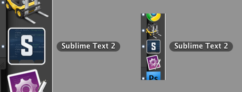
… which stands out nicely on the dock and task switcher.
(Funny thing is I made my own TextMate icon when I first started using it in 2005, before it had a decent icon.)
I’m really enjoying ST2 so far as another TM expat, but the icon could really use a bit of love on OS X.
I can’t stop fussing with this thing. Here’s another pass, this time larger:
…odd having to pick the code to show in the icon. I’m assuming CSS isn’t the most common use of ST2, and there could probably be a more elegant snippet of something on there. But you get the idea.
Hey, all. I’m a TextMate exile and had to change the ST2 icon in order to maintain my sanity. Here’s a placeholder I came up with until a new logo or icon is released. It’s inspired by the TM icon I had been using. I’m attaching a PNG, PSD, and ICNS file. On a Mac, just control-click on the ST2 icon and click ‘show package contents’ and go to Contents>Resources and replace the ICNS file with the new one. You might need to quit ST2 and re-add it to your dock for the new icon to appear.
http://dac.tl/client/dactl/sublime_icon.png
ST2_Icon.zip (104 KB)