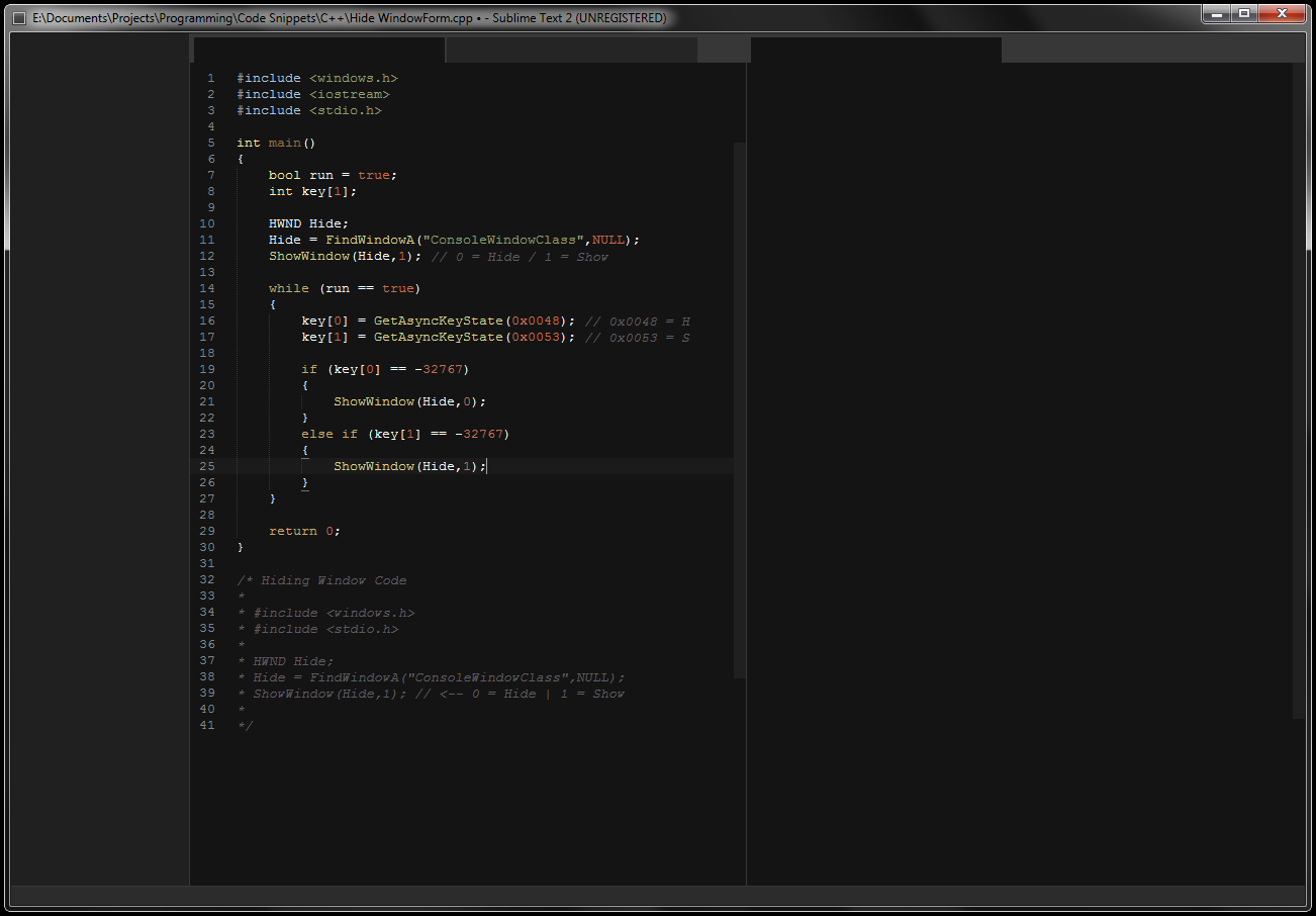
Hello I recently downloaded the Sublime 2 Dev build, and after a few hours of use I found that the interface was quite distracting.
It’s much better than most other text editors I have to say, but I think it can look a lot better with some work.
So I started mocking up a new interface in Photoshop, and after a few hours of work I got this.
Other Color Schemes
Notes:
I didn’t add any text to the interface because Photoshops anti-alias is very ugly on small text, but I think you get the idea.
Also all the colors from one base color because that way you can change the whole interface when you change color scheme.
Tabs
The tabs are based on the Firefox tabs. I personally think they are the perfect size for tabs. They also save quite a few
pixels in the height (The most valuable dimension, especially with the increasing popularity for the 16:9 aspect ratio screens).
Sidebar:
The sidebar is now a lot darker and fits much better with the rest of the interface. The one we currently have is a pain to
use with a dark color scheme because of the huge difference in contrast.
Scrollbars:
The scrollbars are based on the Windows 8 interface, very minimalistic and clean. I would also make them light up to
the same brightness as the color behind the tabs when your mouse is over them.