If I use dark color scheme, it’s very hard to know, which of these tabs is current.
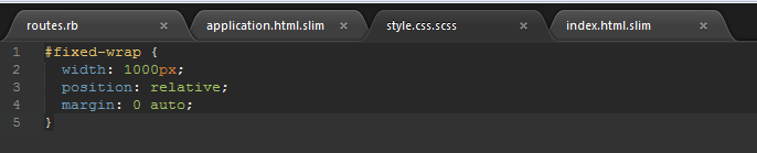
Its ok in light themes:
Is there a way to fix it?
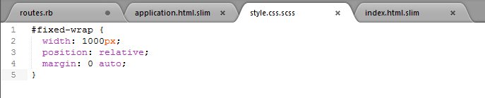
If I use dark color scheme, it’s very hard to know, which of these tabs is current.
Its ok in light themes:
Is there a way to fix it?
I find this as well, and I occasionally close the wrong file 
I presume there is a way to dig into the scheme-files and change the colour settings(?). But, for the moment, I just look at the address bar… or lean slightly forward 
I’d be interested as well if a slight change could be made to this theme. Andy.
I agree, there must be some cool way of slightly differentiating the look of the current tab