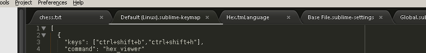
I’m using the default theme… and it’s hard to tell which tab is active.
How can I make the active tab stand out better among all tabs as in for example Google Chrome?
I’m using the default theme… and it’s hard to tell which tab is active.
How can I make the active tab stand out better among all tabs as in for example Google Chrome?
Quick:
open the file “Packages/Theme - Default/medium_dark_selected_tab_bg.png” with Photoshop and draw two white lines on bottom. ( this is what I use, but with soda theme )
Slow:
Find your way with that file, or others from that folder.
One of the unique features of the new default theme is that tabs are integrated better with the code view, making them appear to be seamless. Adding a white line does make it stand out more but I feel that it goes against the intention of the theme. Try a lighter tab outline instead, with a dimmer outline on the inactive tabs.
[quote=“tito”]Quick:
open the file “Packages/Theme - Default/medium_dark_selected_tab_bg.png” with Photoshop and draw two white lines on bottom. ( this is what I use, but with soda theme )
Slow:
Find your way with that file, or others from that folder.[/quote]
Thanks for the suggestion… obviously you are very familiar with the product.
I’m surprised that there’s a ton of discussion about how the logo should be designed, but something as basic as active tab styling is not addressed.
I see that contrast for selected tabs was improved in the recent release. This is great 
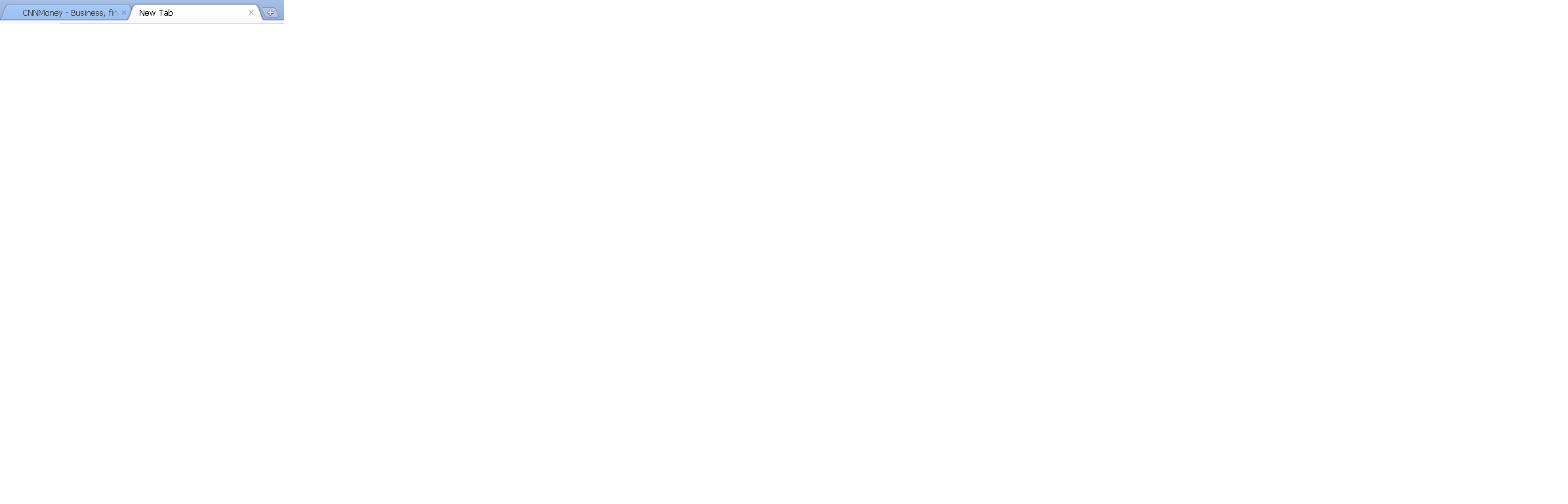
If I may suggest another small tab improvement… It would be nice if we could open a new tab by clicking a “new tab” icon (with a plus sign), see the picture. For me this would work better than typing Ctrl-n, thx.