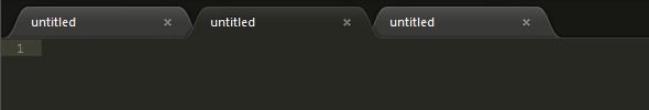
Subtle point, I know, but I think the background color of the tab row needs to blend more with the non-selected tabs rather than the selected tab. Otherwise, I think it sends a mixed message visually about what is primary and what is secondary since the higher contrast between the non-selected tabs and the background makes them pop more.
Current:
Suggested:
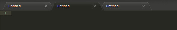
I know there are multiple people creating themes, but perhaps this could be set forth as a design guideline and applied at least to the default theme and possibly all themes that ship with ST2?