I was excited to see that there was a new icon, so I downloaded the new build, and I didn’t like it very much.
Then I thought about it a bit more, and now… I really don’t like it. It clashes with every other icon in my dock because it’s tilted so far backwards.

The Apple Human Interface Guidelines for icon design have this to say:
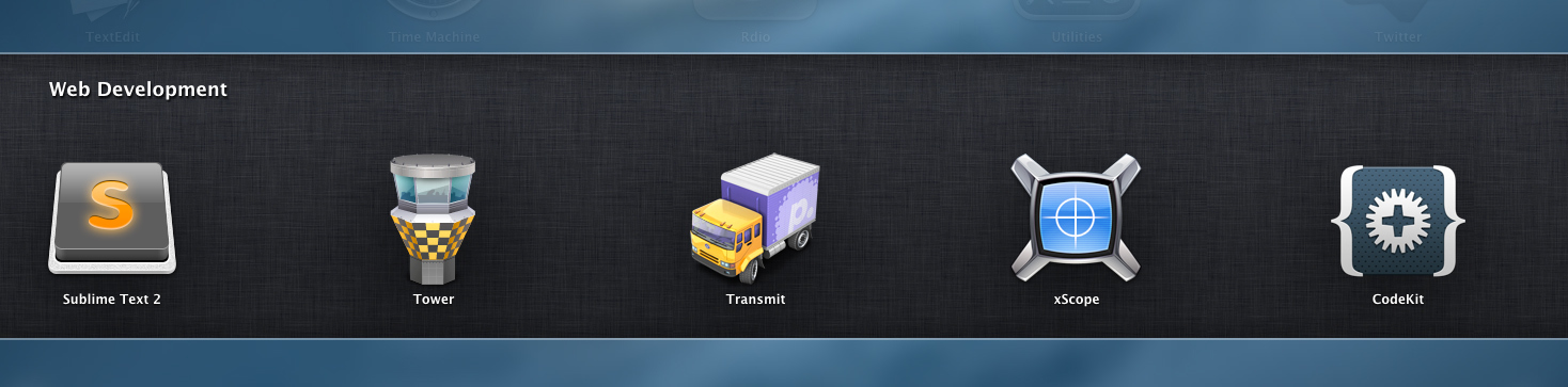
I’m not sure whether to count Sublime Text as a user app or a utility app in this sense, but in either case, the perspective is way off.
I also think this clashes with Windows icon standards. Most Windows icons use the straight-on perspective.
 . But hey, it is pretty easy for people to change their icon.