I’ve made this some time ago. It’s the old icon with letter “S” and “T” merged together – looks kinda like reversed question mark 

New logo discussion?
tdroL
#190
0 Likes
sublimed
#191
[quote=“phillip.koebbe”]

This is the one that I use. I recently experimented with a different one, but came back to this one.[/quote]
+1
0 Likes
aristidesfl
#192
[quote=“chrisguilbeau”]What about the real “S” key from your keyboard
LOVE (almost there, maybe lacking a bit of body, but the best so far)
0 Likes
aristidesfl
#193
[quote=“willy1234x1”]
Inspiration from Adobe icons.
Icon used is from iconSweets2
VERY nice, care to share the actual icon with us, so we can use it for the time being, while we wait for the name and icon to be changed for the final release?
I second this motion, that’s a wonderful icon and very fitting for Sublime Text.[/quote]
This looks really good, but it’s too fancy and finished. it needs to be something stripped out, minimalistic and lightweight, yet beautiful.
0 Likes
Fannon
#194
[quote=“aristidesfl”]
Inspiration from Adobe icons.
Icon used is from iconSweets2
This looks really good, but it’s too fancy and finished. it needs to be something stripped out, minimalistic and lightweight, yet beautiful.[/quote]
This one’s really great!
0 Likes
aristidesfl
#195
[quote=“dperrera”]I took the liberty of cleaning up the icon a little bit. It’s a little darker so it stands out in the dock a bit more. Hope you enjoy.
http://dribbble.com/system/users/698/screenshots/311515/st2.png?1320536625
You can grab the .icns here:
http://cl.ly/BYKS[/quote]
try removing the chrome frame
0 Likes
aristidesfl
#196
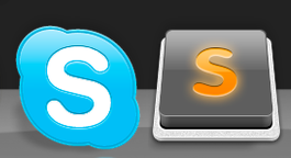
I guess the best characteristic of these logos is they doesn’t have an S. Why does every icon I’ve seen so far has to be an S or have an S when the original icon has nothing?
Can you imagine if every application icon would be or contain the application title initial?
Unfortunately the symbol of the first icon resembles more a note pad then a code editor.
I would love to see the symbol of the second icon (or some other sort of brackets wich represent code) with the visual style of the first icon on the top.
0 Likes
aristidesfl
#197
https://dl.dropbox.com/u/4700116/Screen%20Shot%202012-03-23%20at%2014.26.33%20.png
goo.gl/FyH0i
this one is also very interesting
0 Likes
aristidesfl
#198
https://dl.dropbox.com/u/4700116/Screen%20Shot%202012-03-23%20at%2014.35.28%20.png
Maybe the best so far
0 Likes
Arturo
#199
Hi, guys. Pretty cool works. Here’s my attempt in two flavors, light and dark, to match the theme you are using. I will upload the ICNS if you like them.
0 Likes


chrisguilbeau
#201
[quote=“Arturo”]Hi, guys. Pretty cool works. Here’s my attempt in two flavors, light and dark, to match the theme you are using. I will upload the ICNS if you like them.
I like it!
0 Likes
Arturo
#203
Hi, guys. Thanks for the comments. I tweaked a few small details:
You can download them here: cl.ly/1D2B443s0n0Q2L1Z1c2O
0 Likes
HeroicEric
#204
I didn’t make this but I just saw it on Dribbble.
http://dribbble.com/system/users/2516/screenshots/382465/dribbble.png?1326373488
0 Likes
aristidesfl
#205
[quote=“Arturo”]Hi, guys. Thanks for the comments. I tweaked a few small details:
You can download them here: cl.ly/1D2B443s0n0Q2L1Z1c2O[/quote]
The light and texture are pretty good, but the key too thick…
0 Likes
aristidesfl
#207
[quote=“Arturo”]
What do you mean by ‘thick’? I’d love to improve them.[/quote]
I mean the key has to much height in comparison with the frame (around the key), so reducing the height by half could be enough…
0 Likes
eternus
#209
This link (all 3 actually) keep downloading as corrupt so I can’t use them. Unfortunately I think the current icon (I never saw the June 2011 icon) is horrible and much prefer this version. Is the link busted?
[quote=“natebeaty”]I also put together a dark gray version:
[attachment=1]Sublime Text 2-dark.zip[/attachment]
[/quote]
0 Likes