+1 for not-so-tall tabs whose tops don’t quite touch the top of the app’s title bar.
+1 for more angle on tab ends so we see more “tray” behind tabs, making them more distinct from one another.
Soda Theme Updated (Soda Theme 2)
fburleigh
#19
0 Likes
buymeasoda
#20
Thanks for all the feedback so far, really appreciate it.
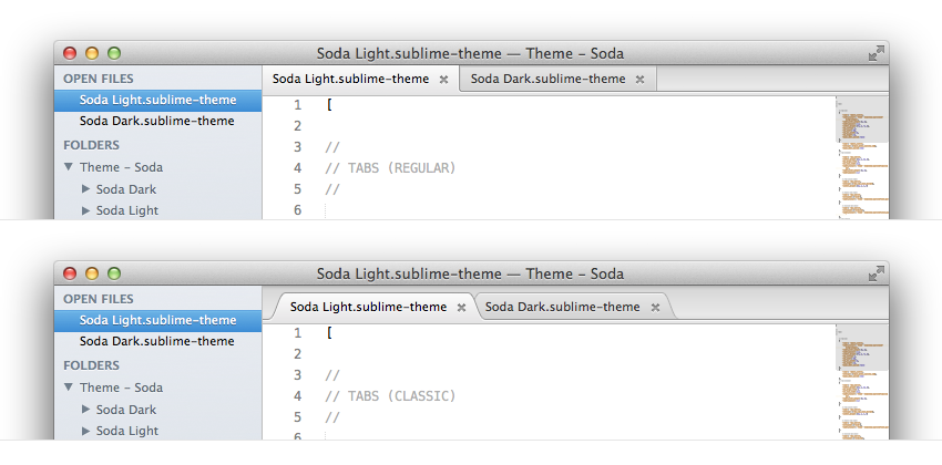
I’ve pushed an update for Soda Light that now includes both square and curved tabs. The tab style can be toggled via a user setting. Square remains the default at the moment, but to opt into using the curved tabs, add the following line to your “Settings - User” file:
"soda_classic_tabs": trueI’m still looking for an elegant way to handle custom settings. I’d like to use more than just booleans, and be able to group together all Soda settings under a single namespace rather than introduce a bunch of top level custom flags that may conflict with each other. If you know how to do that in a way that can be then read by a theme, please let me know 
Here’s a screenshot of the two tab styles for Soda Light:
0 Likes
yqiang
#21
UPDATE:
Nevermind, found out that I had to set “highlight_modified_tabs” to true.
Original:
Great work! It looks like the blue dot that signifies a file has unsaved changes has gone away in this version. Was that intentional? While I didn’t like the look of the blue dot it was good to have a way of knowing if a file had been modified.
0 Likes
buymeasoda
#22
[quote=“stofte”]Just for reference 
Ouch, looking at XP’s outer surrounding chrome I can feel your pain I’ve pushed an update that allows toggling the tab style to a varient of the original tabs using “soda_classic_tabs: true” in your user settings. Hope that helps.
0 Likes
jps
#23
Nice work Ian! 2201 will be out soon with high dpi support, so if you’re in the midst of making images, you may want to do them at 2x resolution (saving the high res versions as foo@2x.png if the normal res version is foo.png), so it’ll look a bit nicer on high res displays.
0 Likes
iamntz
#24
Any chance to get an update for dark version anytime soon? I really like the square tabs & dark things
I think you will make a lot of fan boys very, very happy!
0 Likes
kennonb
#27
Oooh… This is really nice! Great job.
I actually like everything about the new version, even the dirty file indicator.
0 Likes
xapoh
#30
Updated to the latest version (through Package Control).
Love the new ‘modified’ tab indicator (the blue dot)! It was very hard to see before.
But my active/highlighted tabs look strange now. I am on Win7, Build 2203.
With the classic tabs:
…and with the original:

Any idea?
Thank you!
0 Likes
xapoh
#31
Quick update: I replaced ‘tab-*.png’ images with the old versions and tabs are back to normal.
0 Likes
Fatbat
#32
Dying for the dark V2 version! I know you probably hate such a question, but do you have an ETA?
If anyone is interested, this is what I’ve done to my Soda V1 interface. I made custom tabs, a custom dirty indicator, the red dot, and a few other bits on a modified Twilight theme…
0 Likes
Coldblackice
#33
[quote=“Fatbat”]Dying for the dark V2 version! I know you probably hate such a question, but do you have an ETA?
If anyone is interested, this is what I’ve done to my Soda V1 interface. I made custom tabs, a custom dirty indicator, the red dot, and a few other bits on a modified Twilight theme…
http://www.resdivina.com/img/soda-dark-phoenix.png[/quote]
Wow – that is SEX-Y! How does one go about busting that out?
0 Likes
Fatbat
#36
It’s pretty straight forward. You mod a few of the tabs parts in the Soda theme. Here they are. I included some PSDs too in case you want to make the red stripe another colour, orange or blue perhaps. You could modify more parts than this, customize the soda icons further, etc.
http://www.resdivina.com/img/soda-dark.rar
Here is the modified Twilight theme. I’ve called it “Phoenix”.
http://www.resdivina.com/img/phoenix-theme.rar
And you add this to your User Prefs…
{
	"auto_complete_commit_on_tab": true,
	"auto_complete_with_fields": true,
	"bold_folder_labels": true,
	"caret_style": "phase",
	"color_scheme": "Packages/Color Scheme - Default/Phoenix.tmTheme",
	"dictionary": "Packages/Language - English/en_GB.dic",
	"draw_white_space": "all",
	"font_face": "Consolas",
	"font_size": 11,
	"highlight_line": true,
	"highlight_modified_tabs": true,
	"indent_guide_options":

		"draw_normal",
		"draw_active"
	],
	"overlay_scroll_bars": "enabled",
	"scroll_speed": 0.5,
	"shift_tab_unindent": true,
	"theme": "Soda Dark.sublime-theme",
	"trim_trailing_white_space_on_save": true,
	"word_wrap": true
}
That’s it. I would like to figure out how to mod the folder icons in the sidebar and add icons for different file types. If anyone has advice on how to do this, that would be great.
Also, the folder titles don’t bold like they should in the new version.
0 Likes
Fault
#37
So I’m guessing the Soda Dark theme went 2.0 this morning, as when I opened up sublime my tabs went a little crazy; restarted and damn man, they look awesome on Soda Dark. Don’t know why everyone is craving the Chromium tabs as I love what you’ve done with the new ones.
0 Likes
