Sublime Forum

ST2|ST3: Aprosopo Theme

#20

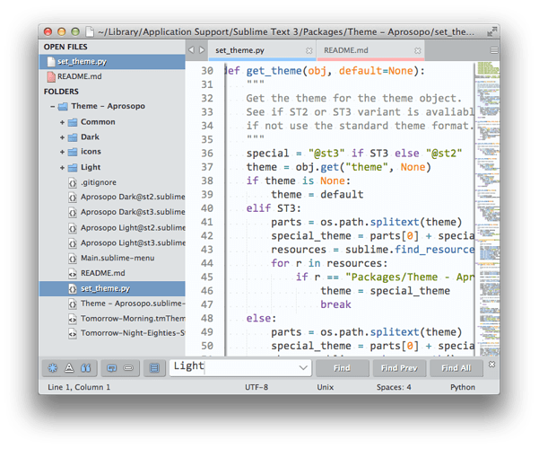
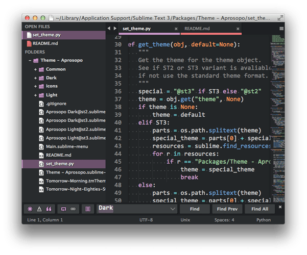
Been stuck at home taking care of injured family member, so I finished up the Light theme (for real this time):

  • Stopped being lazy and finally updated and tweaked all light theme graphics and settings (generally much lighter feel)
  • Cleaned up folder icons
  • New Light Color Scheme (see screenshots)

Within the next week, I will rename the repo to Aprosopo (thanks quodlibet). This will cause the settings to all change. Sorry, but I did tell everyone the theme was in beta and subject to change.

Now is probably the time to give feed back on the light theme. I can’t promise how motivated I will be a week from now :wink:.

So here is the completed light theme compared to dark theme as well:


0 Likes

#21

The more I stare at the light theme’s color palette the more I think it is too…spring. This may change. I am still experimenting with color schemes, but I think the overall UI look of the light theme is done.

I will look around for a decent light color scheme to use for the palette. Maybe I will just borrow the Tomorrow color palette (I did use the Tomorrow Eighties palette for the Dark). Light themes are so hard for me.

0 Likes

#22

Theme has been renamed to Aprosopo. It must now be installed as Theme - Aprosopo. I know this may mess things up for people a bit, but once people change over, it won’t be renamed again.

Light color scheme is now a variant of Tomorrow Theme. It looks much better.

I decided to keep the Light UI colors though. I like most of them, and I have decided I am okay with some of them looking girly (light purple and red); I don’t have to use those, and some people might like them.

So I am done. For real :smile:.

0 Likes

#23

I was about to write and say that my light color scheme kicks your light color scheme’s butt… but not quite :smile:

http://i1.minus.com/jofMHyNvBl8cv.png

In the screenshots I see some nice tweaks that I may plunder, such as changing the triple-quoted strings to resemble comments rather than strings.

Just so I know who to praise/blame, what is the extent of your modifications to the Tomorrow Morning theme? Are they limited to color tweaks, or have you modified the structure of the file?

(Which, in the time that it took me to write all this, I could have found out myself, but I didn’t know what my question was until I got to it :smile: )

0 Likes

#24

In the meantime, I’ve kind of answered my own question.

I ported both Tomorrow and Base16 to Scsscheme, which allows me to plug them in and out of my existing framework (keeping the colors, etc.). I found that Tomorrow seems to have more sophisticated highlighting and that you’ve both appendend new scopes and emended existing ones.

Going through selector by selector should not be too much trouble… But I’ll shut up before I take this thread over the cliff entirely.

Alex

0 Likes

#25

Basically, the themes have evolved. The dark scheme and light scheme share the same highlight palette as the original themes except for maybe background color s and tweaks to non highlight colors. I also have made cosmetic changes to things like python triple quote and other things, some things that only work with my personal language file edits (but they don’t adversely affect the default languages). I also added colors for some of my plugins etc. Though the highlight palette may be the same, not all the elements are guaranteed to highlight like the original Tomorrow schemes.

So in short, there are a number of differences, but none that change the overall feel of the schemes. Basically, I needed to include some kind of scheme with the themes, so I pulled from what I use. I haven’t used light themes in a while, so I did have to update the light theme to use the changes the dark version uses.

0 Likes

#26

Thanks for the info!

I’m making good progress going through your theme and comparing it with the most recent version on the Tomorrow repo.

I am trying an abstract color scheme framework for Sublime using Sass, with the goal of decoupling the core selectors from syntaxes and plugins. (Mostly because I get a kick out of doing so, but also because maintaing tmThemes becomes an enormous headache very quickly.)

And looking at other people’s thoughtfully colbbled together schemes is very enlightening. (And kinda sad :smile: )

0 Likes

#27

@quodlibet Your color scheme is pretty nice, I might check it out and play with it. It seems to look nice with my light theme too.

I imagine people who use light themes probably know or have created some really nice ones. My theme isn’t meant to force people to use my schemes, only to provide “something” in case they don’t have anything that pairs nice (and also to provide my personal themes for myself :wink: ). For instance, you don’t notice it with lots of themes, but when you pair Monokai (the default Sublime Color Scheme) with my dark theme, you see how yellow Monokai is, so it isn’t a real good default choice.

Though the light theme and dark themes are mostly gray neutral colors, they lean towards the “cool” end opposed the the “warm” end with a slightly bluish tint. Solarize Light and Dark seem to go pretty well with the light themes as do others. There are also a number of dark schemes that go good with the dark theme, but I am partial to mine.

I hope the light theme looks a lot better now to people. I feel the styling is consistent between the light and dark theme now but separates the two giving them a more appropriate feel for their intent. The only thing I plan to do moving forward is to redo those “find panel” icons. They work well enough, but I need to redraw them so they fit the style better. The problem is they work well enough, so my motivation to redo them is also low :smile:.

0 Likes

#28

People who use light color schemes are nuts. If I didn’t spend more time writing words than code nowadays, I’d be using a dark theme as well. And if it wasn’t clear, I think your tweaked version of Tomorrow is rather good. For a light scheme :smile:

Alex

0 Likes

#29

I LOVE this theme.
However, I just switched from faceless to Aprospo, and the tab close buttons are gone ?

In fact you can see on the first screen shots on the github page, they are gone there too.

Is there a setting? Am I doing something wrong?

Nevermind-- found it. :blush:

0 Likes

#30

[quote=“Mr-Homer”]I LOVE this theme.
However, I just switched from faceless to Aprospo, and the tab close buttons are gone ?

In fact you can see on the first screen shots on the github page, they are gone there too.

Is there a setting? Am I doing something wrong?

Nevermind-- found it. [/quote]

Go to “Preferences->Package Settings->Theme - Aprosopo” Turn on “Show Tab Close Button” something like that. The reason you don’t see any in the screenshots is because I forgot to turn off “Hide Tab Close Button Except on Hover” which hides the button until I hover over the tab.

“Hide Tab Close Button Except on Hover” must be used in conjunction with “Show Tab Close Button” if you want the auto-hide functionality. Sorry for not making that clear. I need to update the readme.

0 Likes

#31

FYI:

  • Updated light find icons to have a little more contrast
  • Colorized tooltips

I made a request on Package Control as well, so hold tight if you want to install via Package Control.

0 Likes

#32

Really nice theme, faceless. I just found your theme and Im thinking I shouldve visited this thread a long time ago.

0 Likes

#33

Thanks!

0 Likes

#34

Theme now on Package Control.

0 Likes

#35

Unrelated, but let me show you the theme I was working on before discovering yours, which would’ve been a better base than Soda to build upon: (http://i.imgur.com/DSOGMaN.png).
As you can see, it is pretty similar :stuck_out_tongue:. I’ll steal some of your ideas for the panels I think!

0 Likes

#36

[quote=“dubeg”]Unrelated, but let me show you the theme I was working on before discovering yours, which would’ve been a better base than Soda to build upon: (http://i.imgur.com/DSOGMaN.png).
As you can see, it is pretty similar . I’ll steal some of your ideas for the panels I think!

I say loosely based on soda to cover my butt; Everybody usually just copies a theme to get a starting point. The only real thing that is from soda now is the find panel icons. Most of my styling inspiration came from Flatland, Phoenix, and Nil.

I definitely see the similarities.
-I like your hamburger icon for tabs (I think I might steal that idea :smile:)
-I generally like your file icons too. I’ve thought about in the future dropping in different icon styles choices, but I am not really a graphic artist by any means, but I am serviceable for basic things. I still need to re-style the find icons one day…I have also thought about changing the drop down icon beside the folder to a plus/minus convention.

It will be nice to see your theme when its finished. The accent colors are bright, which I like, but the scrollbars are a little too much of the accent (at least for my taste; it is a bit blinding). I would consider subduing those, but overall it looks nice.[/quote]

0 Likes

#37

Thanks, I appreciate the feedback!

Funny thing is that the hamburger comes from the Soda theme :stuck_out_tongue:
As for the icons, I’m not an artist either, but I kinda knew where to look. I really like the style of Visual Studio 2012/2013, so I went for it when looking for icons. I don’t know if I should take the folder icons too, or keep the Piatto’s. Anyway, I made a zip containing the icons I found interesting in VS, plus those that I re-colorized. If you want to go to the source directly, you can too!

Visual Studio Image Library:
microsoft.com/en-ca/download … x?id=35825

Theme icons and others:
dropbox.com/s/2opiexlsmjdrxtx/icons.zip

EDIT: if you just want to change the find icons, then I can’t help, I still need to do it too. I’m thinking smth like the default theme icons, but with more Anti Aliasing. I dont know. Im going to surf the net to find smth to copy I guess. eheh

0 Likes

#38

Some more updates:

  • Smarter menus: certain menu options will take care of setting or unsetting relevant features when enabled or disabled. This helps save how many times you have to go into the menu when configuring your theme

  • When switching from dark to light or light to dark, the plugin will now try and carry over your dirty color. So if I am using dark purple with dirty dark red and I switch to a light blue theme, it will set the corresponding light red.

  • disclosure buttons are much smaller now. They are simple plus or minuses depending on the folder state. So now they much more subdued. But for those who still don’t want to see them:

  • Option to disable disclosure icons (folder expand icons)

  • I got a complaint that the open file icons weren’t desirable because they didn’t show different types like the folder’s file icons (a sublime limitation). So now, for those of you who are just itching to abolish those icons, you can disable them and have nothing except a subdued dirty icon when dirty or a close icon when hovered

  • I got another complaint that showing both the dirty bar and the active bar stacked on top of each other was not aesthetically pleasing. So for those of you want both bars but need them to occupy less room, and maybe even coexist in the same space, there is a new option for combining them. So basically, dirty tabs will show dirty bars, active tabs will show active bars, and dirty active tabs will spawn a new unholy bar which is half active and half dirty…sounds intriguing…

  • Other small changes or things I can’t remember right now

Enjoy!

0 Likes

#39

New find bar icons are in. Screenshots have been updated on the opening page.

0 Likes