Here is another using a slightly different font.
New logo discussion?
jbrooksuk
#7
[quote=“luisvelaz”]Are you kidding? Sublime Text is all about elegance and style, molded from a piece of obsidian, not an anoying lime-lemon editor.
And yes, you are not a designer  [/quote]
No I am not kidding…
Like I said, I am not a designer, so you do not have to repeat it to make me feel bad. I’m a programmer and I work as one. I was bored, and hence the mess that took me 5 minutes to come up with. Most of my time was taken looking for a font.
I’d like to see you do better.
@Sublimator, I agree, dark works, but it’s contradictory to lime, and the theme doesn’t have to change to match the logo. Perhaps a dark version of a better incarnation of a new logo would satisfy.
0 Likes
Anomareh
#8
Is this like some bizzaro thread of the forums where everyone suddenly turns 12?
I agree Sublime’s logo isn’t really informative of it’s purpose. Heck the name it’s self, Sublime Text, is quite a mouth full. As far as your attempt jbrooks I don’t think it really does much to solve the original problem which was not being able to tell Sublime’s purpose from it’s icon. A lime is equally as telling as a black square. Although it was a decent effort for getting ideas flowing.
As far as the other 2 idiots in this thread a favorite quote comes to mind: “Don’t argue with idiots. They’ll just bring you down to their level and beat you with experience.” Just ignore them. They’ll go away faster.
0 Likes
charlesroper
#10
Logos (or icons) shouldn’t be taken literally. Pop open your Windows start (or the equivalent for your OS) menu and look at all the icons. How many describe what the app does? For a more concrete example, look at the icons/logos for IE, Firefox, Chrome and Safari. And what about the Adobe apps?
A good logo and/or icon should encapsulate the brand - the feel, the philosophy, the vibe - of an app, and should make it distinct and recognisable. The current icon, while being a little raw, is reminiscent of the black monolith from Arthur C. Clarke’s Space Odyssey series, which is a brilliant association IMO. It has all the right connotations, and is geekily cool, and shares the Sublime look. What could be more perfect? Take a look:
google.co.uk/images?q=black+monolith
Whoever works on the branding of Sublime (IconFactory would be cool), riffing on the black monolith theme seems like it might be worth considering at least.
0 Likes
Anomareh
#11
I agree with some of your points.
First, saying: “Well all the other icons don’t describe what they’re owners do so it’s ok!” doesn’t make it a good thing to do. Sure there might be other acceptable reasons but that really isn’t one of them. Perhaps the majority of apps just have bad icons? IE is an initial of the app as well as the planet ring giving off the idea it has something to do with the internet. Firefox, again the planet associated with the internet and a fire colored fox. Chome’s icon at least has Google’s colors. Safari’s is a compass indicating you’ll be navigating something. Adobe apps all have the app initials in their icon.
On your second point I agree with what a logo or icon should encapsulate. I personally don’t find that a black square is easily recognizable as “Sublime Text” however. Personally the one major identifiable feature of Sublime to me is it’s minimap. Plenty of other editors can use dark themes or be skinned to be dark. Many people use / prefer dark themes and don’t think of editors as being light or dark.
Again, in the end this is just about an icon and Sublime’s really isn’t so bad that it’s a problem. A strong and stable feature set speaks a lot louder than an icon ever will.
0 Likes
GreyWyvern
#12
I just want to go on record as saying the current icon of ST is perfect. Don’t change anything about it. It’s simple, and clean, just like ST itself. When ST is first installed, a blank, dark-themed window (like the icon!) is the first thing you see, even if you change it later.
As for the full “logo” which currently seems to be “Sublime” in #757575 and “Text” in #000000, all in Trebuchet MS… I like the colours, but IMHO it could be spruced-up a bit, is all.
0 Likes
GreyWyvern
#13
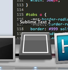
Here is me messing around with a few ideas. Not that a new logo is a big deal or anything ST needs; the current one is, if anything, sufficient. In the following designs I tried to evoke the minimap, which is a defining feature of ST IMHO. I made two of each, one with a slight gradient, and one using the plain original colours.
![]()
![]()
![]()
![]()


0 Likes
charlesroper
#14
I didn’t say that. 
OK, following this logic, Sublime’s icon is as good as any of these other icons. It’s a black square which represents the look of Sublime and its philosophy of zen simplicity and hidden depths. On my Windows 7 task bar it stands out perfectly well, and looks good, unlike some of the other icons. How would making it a more literal interpretation help?
Completely agree. Jon seems to have the aesthetic judgement of a designer even though he may not be a designer (just like Steve Jobs) and I believe the look and feel of Sublime is in good hands with him. The last thing he needs is ‘design by community’ and I’d imagine (I hope!) he’s ignoring this thread.  Although the very fact the community is having this conversation shows that we care. We’re passionate. We love Sublime and want it to succeed. That’s a good thing.
0 Likes
Anomareh
#15
When you started talking about other icons (incorrectly) that failed to do the same thing, that’s what you were implying.
It really isn’t. If you’re only exposure to Firefox/IE/Chrome/Safari/Adobe was looking at their equivalent “tour” pages and then you later saw their icon you’d probably recognize what it belonged to. It’s not necessarily that it should be more literal, just more defining, and being more literal is one way to help accomplish that. There are a lot of apps that have a “dark look and a philosophy of zen simplicity”. Should they all share the same icon? Currently the icon doesn’t identify with it’s owner in any significant or unique way, and in my opinion Sublime is truly a unique editor. If my only exposure to Sublime was it’s tour on the front page and I later saw it’s icon, I’d have no idea what it belonged too.
Indeed.
0 Likes
charlesroper
#16
No, you inferred it. I said “Logos (or icons) shouldn’t be taken literally,” then gave some examples of successful non-literal icons, then went on to say “A good logo and/or icon should encapsulate the brand.” I stand by that argument. I would qualify the first statement with “Logos (or icons) shouldn’t necessarily be taken literally.” A good icon can be literal.
OK, but that’s a different argument. You’re not arguing that the icon should be more literal, but arguing that it should be more distinct. I could agree with you on that, perhaps. However, your original argument was that you should be able to “tell Sublime’s purpose from it’s icon,” which is why I said “Logos (or icons) shouldn’t be taken literally,” which, again, I stand by. You should be able to identify Sublime from it’s icon, that’s true. It’s purpose is inferred from everything you already know about it: you see the icon, you think Sublime, your brain does the rest.
I personally find ST’s logo distinct enough, but then I don’t have any other apps with similar icons, which means for me Sublime ‘owns’ the black square. And I don’t think I’ve ever come across another app with a similar icon. So for these reasons, it is a good icon for me. It may not be a good icon for you because you have a bunch of apps with similar icons. I agree that it could perhaps be made more distinct. I guess it’s for Jon to decide.
0 Likes
Anomareh
#17
The first sentence you type said they flat-out shouldn’t be taken literally. You pretty much just reworded the sentence “Those other icons aren’t literal so this one doesn’t need to be.” which was what I said you were implying and was apparently correct about. No idea why you would refute that and then go on to do exactly what I said it was you were doing.
Saying icons shouldn’t be taken literally then giving examples of successful non-literal icons gives the very implication you believe icons don’t need to be literal because hey here are some successful non-literal ones. Especially only when you go on to say A good logo should encapsulate the brand. in a separate paragraph. I could have listed just as many successful literal icons.
[quote=“charlesroper”]OK, but that’s a different argument. You’re not arguing that the icon should be more literal, but arguing that it should be more distinct. I could agree with you on that, perhaps. However, your original argument was that you should be able to “tell Sublime’s purpose from it’s icon,” which is why I said “Logos (or icons) shouldn’t be taken literally,” which, again, I stand by. You should be able to identify Sublime from it’s icon, that’s true. It’s purpose is inferred from everything you already know about it: you see the icon, you think Sublime, your brain does the rest.
I personally find ST’s logo distinct enough, but then I don’t have any other apps with similar icons, which means for me Sublime ‘owns’ the black square. And I don’t think I’ve ever come across another app with a similar icon. So for these reasons, it is a good icon for me. It may not be a good icon for you because you have a bunch of apps with similar icons. I agree that it could perhaps be made more distinct. I guess it’s for Jon to decide.[/quote]
I was arguing that being literal is a way of making an icon more distinct (which I prefer over just being something abstract). If Sublime’s icon was a black square with a pencil or a cursor then surely it wouldn’t be the icon for the media player “with a dark look and a philosophy for zen simplicity”.
0 Likes


GreyWyvern
#19
So how about some logo ideas that include the icon? Best of both worlds?
![]()


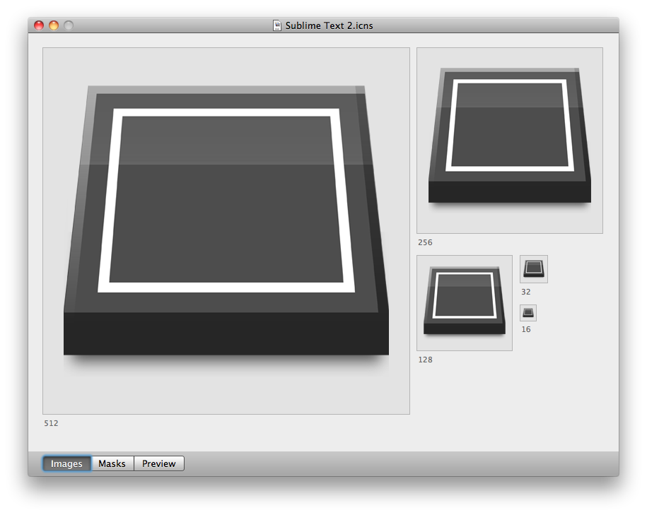
Here is a 128px x 128px blowup of the icon in case anyone wants to use it:

0 Likes
Linux .desktop file
charlesroper
#20
That’s true, although I later qualified that with necessarily which you perhaps missed?
With the greatest respect, you’re putting words in my mouth. That’s a misrepresentation of my position; a straw man argument. You’re quite literally inferring this as you inferred that other sentence you made up. I am implying that logos/icons should not necessarily be literal.
I gave some examples of successful icons that aren’t literal. I am saying that icons shouldn’t necessarily be literal. What is your point here?
OK, you could have listed just as many successful literal ones - so why didn’t you?
You seem to be plucking bits of my argument out in support of your own and not taking the whole thing into account. To put things simply so that you don’t misunderstand me, the vast majority of icons are not literal, they are abstract. Most successful icons are abstract and do not literally represent what the application does. This is a basic principle we learn at design school in logo and branding classes. It’s been over 10 years since I was at design school, but the principle hasn’t changed. I’m not just making this stuff up.
You may prefer it, but the body of evidence suggests that successful icons tend to be more abstract than literal. An allusion rather than a realistic rendering. I have no problem with the icon being more distinct, but it looks pretty good to me already. It works.
Surely the icon is alluding to a blank slate? That suits a text editing app, right? What are blank slates for after all (apart from roofing material, of course)? A black square with either a pencil or a cursor is cheesy and cliché. But maybe that’s appropriate for the feel Jon is going for? What do you think?
@marksteve Nice - that makes the blank slate idea more obvious and fits with the definition of sublime as “sloping up to the lintel”, although it loses some of its purity. How does it look at different sizes?
0 Likes
Anomareh
#22
I just don’t understand why you would emphatically state that icons shouldn’t be literal to later go on and say that, literal icons can be ok. Perhaps later on you’ll decide literal icons can be just as good as non-literal ones and then maybe decide literal icons are the best. How am I supposed to take what you’re saying seriously when you’re constantly changing you’re stance.
It really isn’t. The first paragraph of your argument was as follows. Icons should not be literal (which you later amended which doesn’t really make your argument any stronger if you’re going to be constantly changing your stance). Then you went on to list several icons that you considered to be successful non-literal icons. What conclusion do you expect someone to draw from that? I’d argue the only rational conclusion to draw from that would be that icons shouldn’t be literal because there are successful non-literal ones.
I was reiterating my previous statement for clarity.
You seem to be plucking bits of my argument out in support of your own and not taking the whole thing into account. To put things simply so that you don’t misunderstand me, the vast majority of icons are not literal, they are abstract. Most successful icons are abstract and do not literally represent what the application does. This is a basic principle we learn at design school in logo and branding classes. It’s been over 10 years since I was at design school, but the principle hasn’t changed. I’m not just making this stuff up.
For the same reason I felt you didn’t need to list a handful of what you perceived to be successful non-literal icons that nearly every computer user sees on a daily basis. Do you need me to list some successful literal icons?
I’m really not. You’re stating the same thing over and over and it’s the exact thing I’m describing. You are not actually giving reasons for why a non-literal icon is better than a literal one. The only reason you’ve supplied for them being better is that you know of more successful abstract ones than literal ones. What exactly are the criteria you are requiring for an icon to be considered “successful”? To be honest, you’ve yet to actually supply a real argument. You have merely been stating a personal opinion.
What body of evidence would that be? Perhaps this is all hinging on your definition of literal? Icons and logos can be literal in different senses. A bottle is not the only way for a Pepsi logo to be literal. YouTube, NFL, and perhaps even to the degree of Twitter’s silhouette of a bird could all be considered rather literal. Non-literal, abstract icons and logos would be that of the likes of Pepsi and Chase Bank. You’ll actually find “non-literal” and abstract icons / logos are quite in the minority.
A blank slate suits many things. It’s a blank slate. It’s the base of many things, hence why it makes a bad icon. It could be alluding to a number of things.
0 Likes
charlesroper
#23
I made a mistake which I corrected in order to clarify what I am saying. I’m only human and I’m sure I’m not the only one to be imprecise in my language. I didn’t mean to emphatically state that icons should never be literal. I’m not constantly changing my stance - that’s an exaggeration, hyperbole. My stance is clear.
You invented two sentences and actually quoted me on them and now also made an exaggeration. That really is a straw man argument. Given that my first sentence was at first imprecise, for which I apologise, I can see how you drew your conclusion initially. It’s no big deal, just a misunderstanding because of my imprecise language. My bad. But I did clarify what I was trying to convey and you’ve continued to attack me on my first faulty, but now corrected, sentence. It feels like you’re ignoring what I’m actually saying just so you can declare victory rather than reach an amicable understanding. If victory means so much to you, please do accept it with my best wishes. Maybe we need some debate victory medals on this forum?
Let me break down what I am saying so that there can be no misunderstanding:
My assertion: Icons should not necessarily be literal
My evidence: Most successful icons are not literal
My conclusion: Therefore the Sublime icon does not need to be literal in order to be successful
Clear?
You could do, and it would certainly strengthen your argument. Why have you not? Because it’s hard to find good literal icons perhaps? I’ll help you out if you like: OS X has some notable literal icons such as iCal, Address Book and iPhoto. Obviously listing a few decent literal icons wouldn’t prove your point unless you could gather a list of all literal icons and compare them to a list of all non-literal. What we can do is look at our own task bars or start menus or docks or whatever and get a rough idea of the ratio of literal to non-literal icons. I invite you to do that. I am saying that most icons are non-literal in my task bar and start menu. I am saying most well known recognisable and therefore successful icons are non-literal. I am saying that Sublime’s icon does not need to be made more literal. You say it needs to be more distinct by making it more literal. I say if Jon wants to make it more distinct, he doesn’t need to make it more literal.
Non-literal is not necessarily better, but it gives you a greater amount of flexibility when trying to convey all of the fuzzy stuff encapsulating a brand. More flexibility is better. Tell me why the Sublime icon needs to be more literal in order to make it distinct.
You are stating your personal opinion too, that the Sublime icon should be made more distinct by making it more literal - you’re saying we should be able to “tell Sublime’s purpose from it’s icon.” If you knock out “purpose” from that sentence, we’d be in agreement.
The criterion I have for judging an icon to be successful is the body of icons and logos and brands I see around me and making a judgement call on which are successful based on whether the company or product is successful. Is that not reasonable?
The body of icons and logos and brands all around us. Maybe you see the world differently but I perceive there to be more abstract icons than literal ones from which I infer that abstract tends to be more successful.
Maybe it is hinging on both of our definitions of literal? My definition is in the traditional sense: non-abstract, factual, avoiding metaphor, non-figurative. What is yours?
The Pepsi logo is not a bottle (that would be one of Coke’s branding styles); the Pepsi logo is entirely abstract and non-literal.
I see what you’re getting at, but only the NFL logo is really anything like literal. YouTube uses metaphor: a red bezelled rectangle that is suggestive of old-style TVs. That’s not a literal rendering of online video. Twitter uses the metaphor of a bird (which twitters) and is therefore non-literal. If Twitter were a site about birds, then it would be close to literal. But Twitter isn’t a site about birds, which makes the logo non-literal. See what I mean?
Take a look through a logo/branding/icon gallery site and see how many are non-literal vs literal. The statement “You’ll actually find “non-literal” and abstract icons / logos are quite in the minority.” is factually and demonstrably incorrect. Try here for instance: underconsideration.com/brandnew/
I think what you’re saying is that some logos have some element representing a sort of stylized literal rendering of a real-life object or product or organization. That’s a fair observation. But it doesn’t detract from the idea that logos don’t need to be literal and that most, in fact, are not literal and therefore Sublime’s does not need to be literal either.
Your opinion is that icons are better if they’re more literal and yet you’ve given nothing to support your claim. My opinion is that icons aren’t necessarily better if they’re more literal and have given plenty in support of my claim. Your opinion is that it’s a bad icon because it’s not distinct enough and would be improved by making it more literal. My opinion is that it’s a pretty good icon and doesn’t need to be made more literal, although it might be improved by making it more distinct. Perhaps we’re both right. This isn’t a binary issue. Icons don’t need to be either absolutely literal or absolutely abstract and neither of us is arguing that. Either way, I think Jon should spend his efforts elsewhere. As should we.
0 Likes