(This is an introduction to the user interface of Sublime Text, it's the first in a series)
My background is in building tools for games. I've encountered some beautifully designed tools for artists, such as Modo, ArtRage and Silo. At the time I was using Vim in its 16 colour, 80 column glory, and the very colourful Visual Studio. It occurred to me: why couldn't the humble text editor get some of this love?
I've tried to put some of this user interface craftsmanship into Sublime Text. There are three principles I felt would be required:
- Unobtrusive, minimal chrome. The focus should be on the text, not fourteen different toolbars.
- Don't obscure the text with dialogs.
- Use the pixels you've got. Full screen, multi monitor and editing files side by side should all be possible.
Below is a short tour showing how I've applied these rules in building Sublime Text. First, here's the basic day-to-day level of chrome you are presented with:

There's not much there, and it's certainly not yelling at you.
Functionality like find and replace, that would generally be implemented via dialogs, is instead presented as a panel at the bottom of the screen.

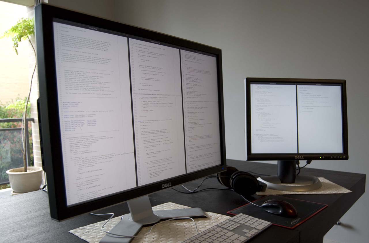
The crown jewel, however, is how it works when you start to get serious. The full screen mode does away with a maximum amount of chrome, and works seamlessly with multiple monitor setups. Here you can see Sublime Text running on two monitors, full screen on each, with five files being edited side-by side.
Here's a screenshot of the large monitor in the above photo, editing three files side by side in full screen. (Warning: 2560x1600 pixels ahead!)

Have I missed any principles? Have I adhered to the ones I set? I'd love your thoughts and feedback.
(Subscribe to the blog, so you don't miss part two!)